
LADEW GARDENS REBRAND
Branding, logo design, and social media rollout.
The goal of the Ladew Gardens rebrand was to refresh their existing identity and align their outdated designs with the organization's growth and evolving audience. By modernizing their visual presence, I aimed to reflect the natural beauty of the gardens while preserving its rich history.
As the sole designer, I handled everything, from conducting research and communicating directly with the team at Ladew Gardens to get a feel for their regular visitors, to executing the final design. One of the most rewarding aspects was developing the new logo, which perfectly merges the historical elements of the gardens with a modern, refined look that would resonate with both longtime visitors and newcomers alike.


ORGANIZATION OF INFORMATION & HONORING HISTORY THROUGH DESIGN
The logo is direct inspiration from on-site elements such as the intricate wrought iron gate that is seen in the gardens. This logo pays homage to Ladew’s mission statement of celebrating the art of horticulture and promoting the gardens. For smaller scale, a lettermark was also made from the primary logo. The color choice provides options for each season of Ladew, and the typography choices provide elegance while keeping readability for all visitor age ranges in mind.
The website fully organizes all of Ladew’s information, making visit and event planning accessible. The website design also highlights photography as a way to reach new audiences. This rebranding consisted of lots of on and off-site research, and speaking to visitors and employees of Ladew.
View the full brand guide here.

Website homepage

Website secondary page
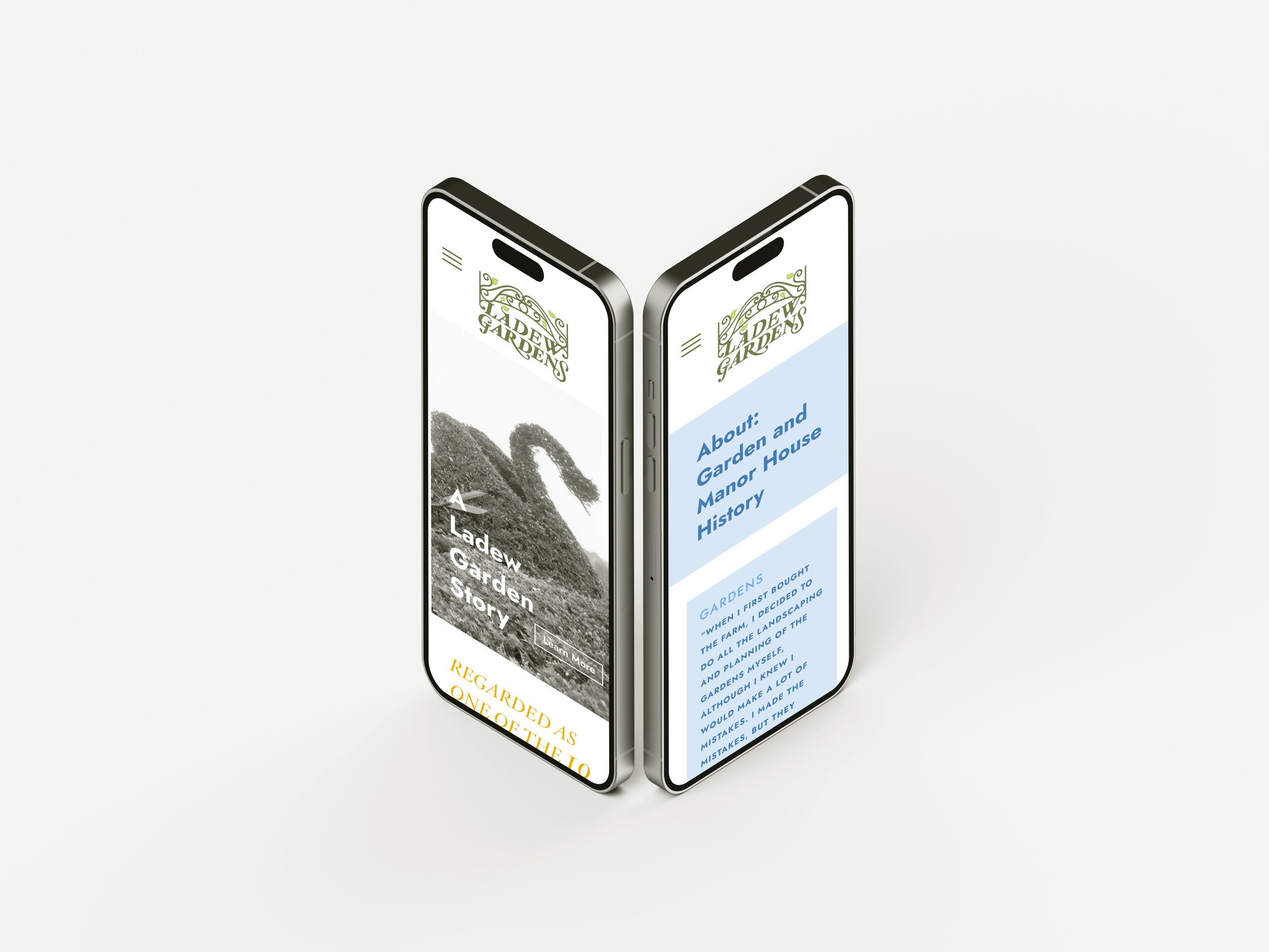
Mobile website
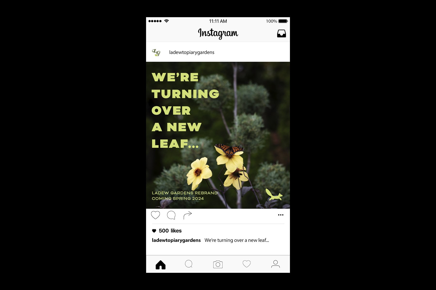
Social media rollout post

Stationary