BRIIU
Package design and brand identity.
BRIIU is a conceptual vegan and non-dairy iced-latte brand designed to bring energy, personality, and plant-based values to a younger audience. Created for a packaging assignment, the project involved developing the name, visual identity, and full packaging system from the ground up.
I crafted every element, from the logo and brand voice to the packaging design and style guide. The goal was to create something that felt bold, current, and accessible to high school and college-aged consumers, while staying true to the brand’s values of sustainability and vibrance.
I’m most proud of how the final brand feels fresh and trendy without sacrificing clarity or substance. BRIIU feels like something you'd genuinely find in the hands of its target audience.
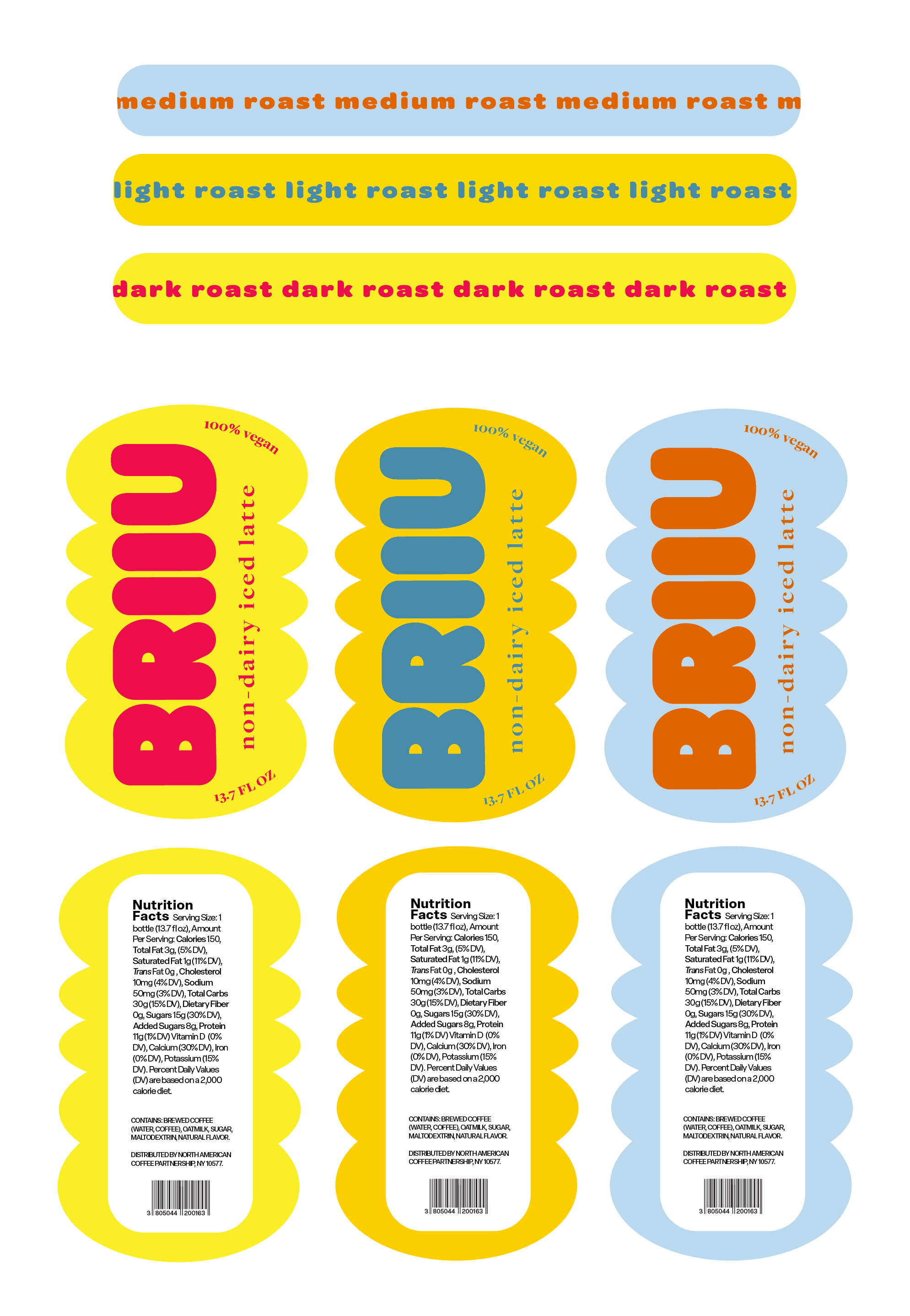
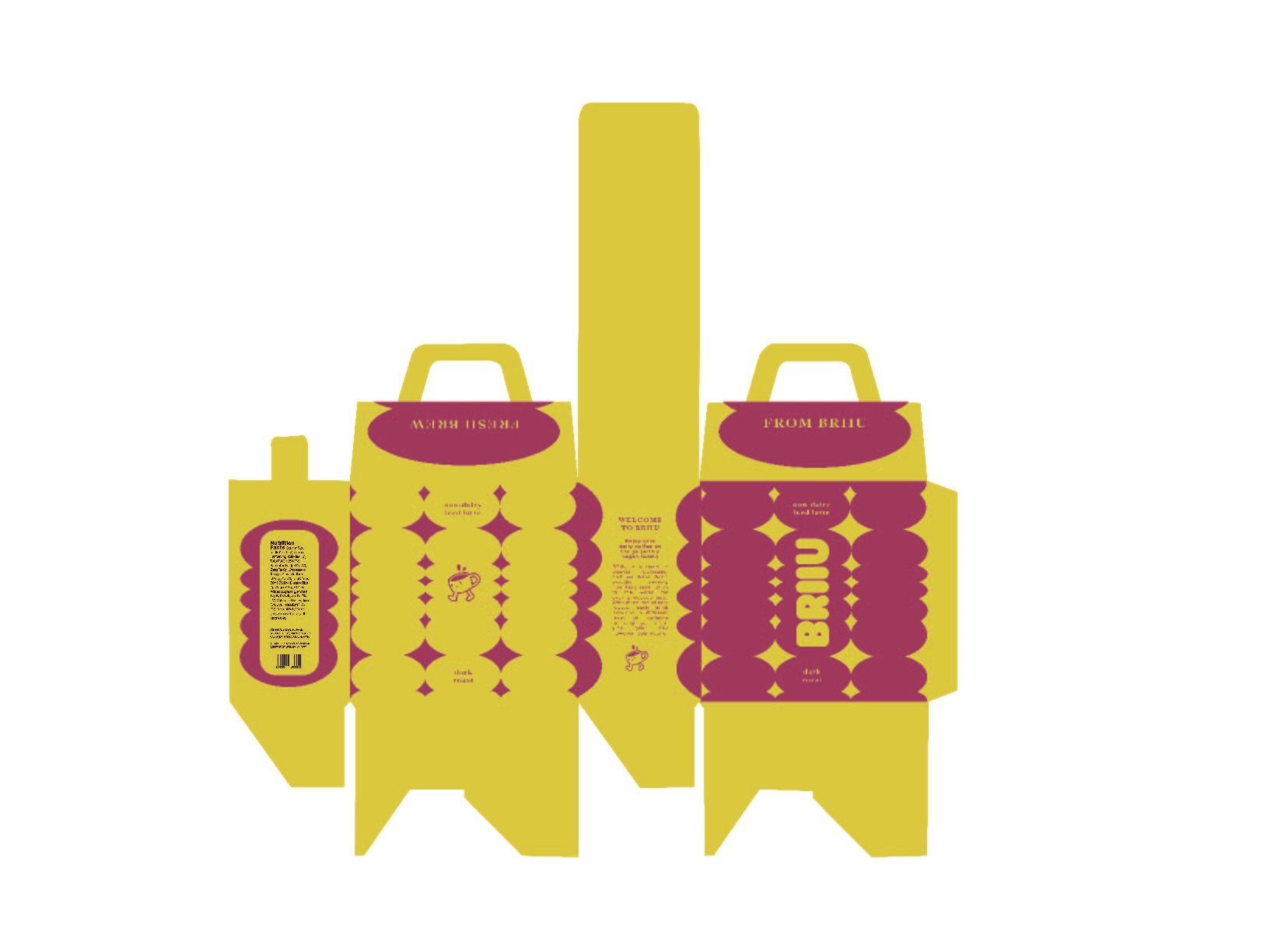
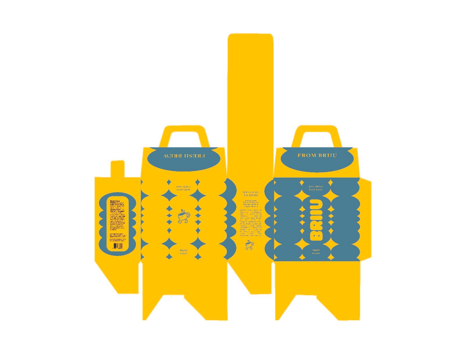
BRIIU uses a palette of bright earthy colors, bubbly shapes, and a coffee cup mascot, all adhering to the company’s target audience of high-school-age youth to young adults, while the earthy colors also communicate their underlying commitment to an earth-friendly and vegan-inclusive environment.
Each color combination and labeling on the front and back of the box indicates which level of roast the drink comes in, and every bottle comes with a label seal on the cap that indicates this distinction as well. One box holds six bottles.
USING SHAPE AND COLOR

Labels file

Unfolded box file

Unfolded box file

Unfolded box file


